As each value equally (1/n) contributes to the estimation of the OLS
regression line (refer to the normal equations for solving the OLS
regression), outlying values might distord the slope of the linear trend. If
we consider instead using the absolute vertical deviation as a weighting
scheme, also called L1 regression, the corresponding contribution of each
outlier is lowered.
The following example should help comparing the two approaches. We create
artificial outliers by adding random exponential deviates to y values. The
parameter of the exponential distribution is fixed to 1. As a consequence, we
get “positive” outlying values.
> n <- 100
> x <- rnorm(n)
> y <- 2*x+rexp(n,1)
> plot(x,y)
> points(x[x<1 & y>5],y[x<1 & y>5],pch=19)
> ols <- lm(y~x)
> abline(ols)
> summary(ols)
Call:
lm(formula = y ~ x)

Residuals:
    Min      1Q  Median      3Q     Max
-0.9057 -0.7418 -0.3131  0.4525  6.3636

Coefficients:
            Estimate Std. Error t value Pr(>|t|)
(Intercept)   0.9092     0.1106   8.217  8.7e-13 ***
x             1.9970     0.1008  19.812  < 2e-16 ***
---
Signif. codes:  0 '***' 0.001 '**' 0.01 '*' 0.05 '.' 0.1 ' ' 1

Residual standard error: 1.091 on 98 degrees of freedom
Multiple R-Squared: 0.8002,     Adjusted R-squared: 0.7982
F-statistic: 392.5 on 1 and 98 DF,  p-value: < 2.2e-16
> library(quantreg)
> lad <- rq(y~x)
> abline(lad\$coefficients[1],lad\$coefficients[2],col=2)
> summary(lad)
Call: rq(formula = y ~ x)

tau: [1] 0.5

Coefficients:
            coefficients lower bd upper bd
(Intercept) 0.63507      0.45152  0.76212
x           2.08776      1.77945  2.20147
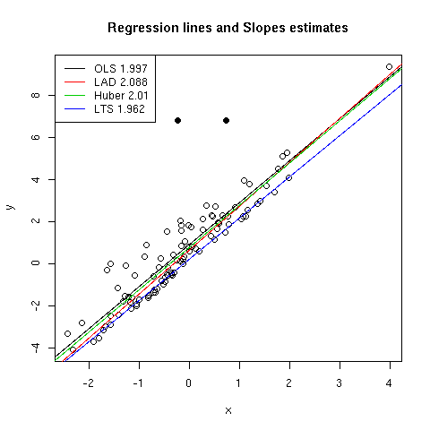
OLS regression line is plotted together with the dispersion diagram in
[Fig. 1]. Two influential points have been highlighted in this figure using
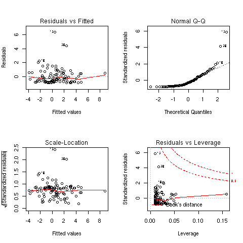
plain symbols. Various diagnostic plots are reported in [Fig. 2] and were
produced using plot(ols). We can check that some of the observations are
considered as being influential (e.g. obs. 12, 13 and 32), based on their
residual values or Cook's distance. Two of them were already considered as
outliers. OLS slope estimate (`beta`1) is found to be 1.997 while LAD
slope estimate is slightly larger (2.088). If we compare the intercepts, which
in our case are directly impacted by the random exponential deviates on y
axis, we can see that the OLS one (0.909) is larger than what LAD gives
(`beta`0=0.635). This reflects the adjustment of the OLS predicted
values toward the vertical bias induced by the outliers.
LAD technique inherits from the work of Koenker and coll., for example [1]
and [2]. There is also a recent article of Koenker and Hallock entitled
Quantile Regression (a local copy is provided here: QRJEP.pdf)
and published in the Journal of Economic Perspectives (15(4): 143-156,
2001). R provides tools for quantile regression in the quantreg package. By
default, the median is used (tau=0.5) and this corresponds to what is called
Least Deviation Regression since using the L1 norm is equivalent to working
with the .5 quantile.
Figure 1: Effect of different regression techniques on estimated slope.
The code below illustrates two other commonly used robust regression
techniques, namely Huber regression and Least Trimmed Squares
regression. Huber robust regression is a compromise between OLS and LAD
regression. Instead of choosing a constant weight (OLS) or a weight inversely
proportional to the absolute deviation of the residuals (LAD), one can opt for
a mixed approach and take into account an estimate of the standard deviation
when weighting the residuals. On the other hand, LTS regression is a
resistant regression technique which we will not explain here.
J. Faraway covers these topics in greater details in his
on-line handbook on
regression (Chapter 13). G. V. Farnsworth also wrote a tutorial on doing
Econometrics
in R, which contains information relevant to quantile and robust regression
techniques (Chapter 4).
> library(MASS)
> hm <- rlm(y~x)
> abline(hm\$coefficients[1],hm\$coefficients[2],col=3)
> summary(hm)
Call: rlm(formula = y ~ x)
Residuals:
    Min      1Q  Median      3Q     Max
-0.7872 -0.6093 -0.1838  0.5701  6.5004

Coefficients:
            Value   Std. Error t value
(Intercept)  0.7757  0.0756    10.2635
x            2.0105  0.0689    29.2002

Residual standard error: 0.8644 on 98 degrees of freedom
> #library(lqs)  # library lqs is now included in the MASS package
> lts <- ltsreg(y~x)
> abline(lts\$coefficients[1],lts\$coefficients[2],col=4)
> legend.text <-
c(paste("OLS",round(ols\$coefficients[2],3)),paste("LAD",round(lad\$coefficients[2],3)),
paste("Huber",round(hm\$coefficients[2],3)),paste("LTS",round(lts\$coefficients[2],3)))
> legend("topleft",legend.text,lty=1,col=1:4)
> title(main="Regression lines and Slopes estimates")
As can be seen from [Fig. 1], Huber method leads to intermediate results:
the regression line lies between those estimated using OLS and LAD regression,
in particular for low to intermediate values of x which correspond to the
greatest influence of our exponential random deviates added to the y
values. On the contrary, LTS failed to uncover the main association between X
and Y since the regression line is far below the principal axis of the
bivariate cloud. In fact, this is partly due to the fact that there are
relatively little outliers (compared to the sample size) and the LTS is quite
outperforming in this case.
Figure 2: Diagnostic plots for the OLS regression.
Recall that the slope coefficient estimate `beta` in a simple linear model is
related to the sample Pearson correlation coefficient r in the following way:
where Sx and Sy stand for the standard deviations associated with X and
Y.
It is easily seen from the above formula that the regression coefficient is
related to the correlation coefficient up to a constant, which is precisely
the ratio between Y and X standard deviations.
The following example illustrates that knowing the correlation between two
continuous variables together with their standard deviations allows to
estimate the slope coefficient of a linear regression without explicitly
computing the regression model (shown at the end of the code snippet).
> n <- 100
> true.sdx <- 2.5
> true.slope <- 3
> x <- rnorm(n,23,true.sdx)
> y <- true.slope*x+rnorm(n)
> sdx <- sd(x)
> sdy <- sd(y)
> cor.xy <- cor(x,y)
> cor.xy*((n-1)/n*sdy)/((n-1)/n*sdx)
[1] 2.962331
> cor.xy*sdy/sdx
[1] 2.962331
> coef(lm(y~x))[2]
       x
2.962331
> plot(x,y)
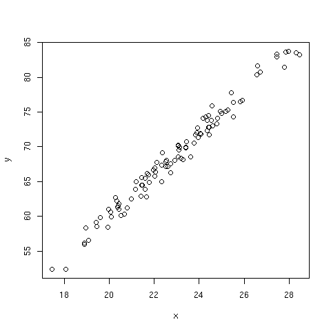
Figure 3: Plot of outcome y versus predictor x (the slope is estimated to be 2.96).
If the relation between y and x is quadratic, the Pearson correlation is
obviously not a good way to reflect the trend between the two variables since
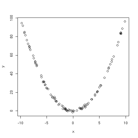
it is a measure of linear association. In particular, if E[y|x]=x2, the
curve describing the variation of y as a function of x should look like a
parabola [Fig. 4]. Now, when y takes approximately the same value, the
corresponding x values can be both positive and negative (if x is centred on
0, which is the case in the above hypothesis as x values uniformly lie on the
[-10,10] interval).
The following piece of code demonstrates the intuitive idea developed above.
> n <- 100
> x <- runif(n,-10,10)
> expected.y <- x^2
> y <- x^2+rnorm(n)
> cor(x,y)
[1] -0.06221294
> plot(x,y)
Figure 4: Plot of y versus x, where xi are uniform deviates and E[y|x]=x2.
As can be seen, the correlation is close to zero. We can run a small
simulation experiment in which we replicate the above code, say 100 times.
Here is a short function doing the main computation:
sim <- function(n=100) {
    x <- runif(n,-10,10)
    y <- x^2+rnorm(n)
    return(cor(x,y))
}
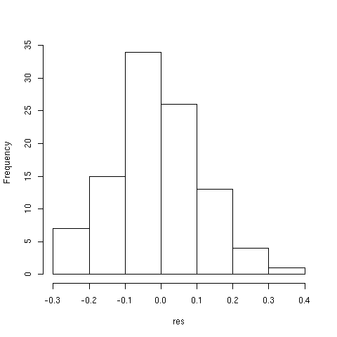
Now, we can check the distribution of correlation estimate for 100 random
samples as follows:
> set.seed(12345)
> res <- replicate(100,sim())
> summary(res)
    Min.  1st Qu.   Median     Mean  3rd Qu.     Max.
-0.27970 -0.08975 -0.02419 -0.01665  0.07211  0.31570
> hist(res)
Estimated correlation range from -0.28 to 0.32 and the average correlation is
-0.02. We can thus be confident in the hypothesis of a zero expected
value. The distribution of the statistics is illustrated in [Fig. 5].
Figure 5: Variation of Pearson correlation for 100 random samples.
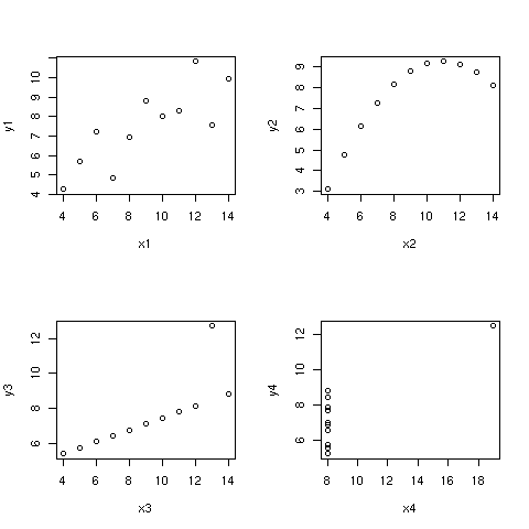
This reminds of Anscombe's [3] data whereby a slight rearrangement of the
(x,y) values leaves the correlation unchanged but gives a drastically
different picture of the relationship [Fig 6].
> data(anscombe)
> var.names <- colnames(anscombe)
> par(mfrow=c(2,2))
> for (i in 1:4)
+ plot(anscombe[,i],anscombe[,i+4],xlab=var.names[i],ylab=var.names[i+4])
Figure 6: Anscombe's dataset: All correlations are 0.816.
Case 1 corresponds to a quite reasonable hypothesis of a linear relationship
between the two variables. Case 2 corresponds to the one discussed
earlier. Case 3 illustrates the influence of a single outlier on slope
estimate of an otherwise perfect linear association. Case 4 clearly advocates
the absence of influence of x on y since different values of y are observed
although they refer to the same x value.
First, we set up the data:
> HIV <- matrix(c(3,2,4,22),nrow=2)
> dimnames(HIV) <- list(c("Cases","Noncases"),c("Exposed","Unexposed"))
> HIV
         Exposed Unexposed
Cases          3         4
Noncases       2        22
> apply(HIV,1,sum)
   Cases Noncases
       7       24
> apply(HIV,2,sum)
  Exposed Unexposed
        5        26
Next, we can computed the corresponding association measures:
> er <- (HIV[1,1]/sum(HIV[,1]))-(HIV[1,2]/sum(HIV[,2]))
> rr <- (HIV[1,1]/sum(HIV[,1]))/(HIV[1,2]/sum(HIV[,2]))
> or <- (HIV[1,1]*HIV[2,2])/(HIV[2,1]*HIV[1,2])
These estimates are reported in [Tab. 1]. Excess risk represents the
difference between risk in exposed population versus risk in unexposed
population; here, this difference is estimated to be 0.45. Relative risk is
computed as the excess risk in exposed population taking the unexposed
population as the baseline: we can conclude that exposed female partner are on
average 3.9 more likely to be infected by HIV that unexposed women. Finally,
odds ratio is 8.25. Its interpretation is less appealing than the previous
ones, as noted by the authors (pp. 46-47), but we can note that in this case
RR and OR are not very close one from the other. This is because the outcome
is not very rare (7/31), which could be partly due to the small sample size in
this prospective study, thus giving an unclear idea of overall prevalence in the
population.
Table 1: Association measures for the HIV data.
|
ER
|
RR
|
OR
|
|
0.45
|
3.90
|
8.25
|
We happen to set up the data as previously:
> ESOP <- matrix(c(255,9,520,191),nrow=2)
> dimnames(ESOP) <- list(c("Control","Case"),c("0-9 g/day","10+ g/day"))
> ESOP
        0-9 g/day 10+ g/day
Control       255       520
Case            9       191
The odds ratio is given by
> (ESOP[1,1]*ESOP[2,2])/(ESOP[1,2]*ESOP[2,1])
[1] 10.40705
So we would conclude that there exists a strong association between the risk
factor — tobacco consumption — and the outcome, which in this case is the
risk of developing a cancer.
> library(vcd)
> or <- oddsratio(ESOP,log=FALSE)
> or
[1] 10.40705
> confint(or)
          lwr      upr
[1,] 5.333583 20.30656
> plot(or)
> fourfold(or)
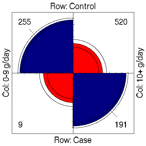
The command plot(or) only represents OR value and its confidence interval as
a graphical output. However, the last plot (fourfold(or)) is reproduced in
[Fig. 7] since it allows to graphically visualize the table of counts. This
kind of graph was proposed by M. Friendly, see [4] and [5]. We can check
how the OR is departing from 1 by looking at the extreme arc which do not
cross together (for adjacent categories).
Figure 7: Association plot for the study on esophageal cancer.
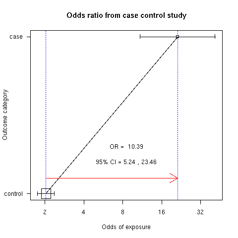
However, if we consider the relative proportion according to the two
subgroups, Case and Control, we see that the odds of exposure (the probability
of developing a cancer when tobacco consumption exceeds 10 g/day compared to
the case where tobacco consumption is less than 10 g/day) is larger (x10
approximately) for the case than for control group [Fig. 8].
> library(epicalc)
> cci(191,520,9,255,design="case-control")
          Exposure
Outcome    Non-exposed Exposed Total
  Negative         255     520   775
  Positive           9     191   200
  Total            264     711   975

OR =  10.39
95% CI = 5.24 23.46
Chi-squared = 64.95 ,  1 d.f. , P value = 0
Fisher's exact test (2-sided) P value = 0
Figure 8: Comparison of odds of exposure for case and control.
It can be shown that `E(t)=int\ S(t)\ dt`, e.g. [6]. Integration is done
on a support ranging from time 0 up to the last recorded uncensored
time. Clearly, if the largest follow-up time is right censored, we would not
be able to estimate the integrand and get a reliable estimate of the mean
survival time.
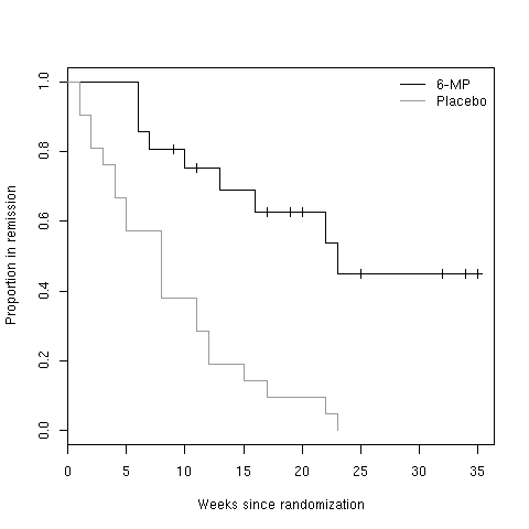
If we take the leukemia data, a quick look at the survival function indicates
that we cannot estimate mean survival time for the 6-MP group, since last
measurements are all right censored. However, we can estimate that for the
Placebo group.
> LEUK <- read.table("leuk.txt",header=TRUE)
> library(survival)
> LEUK.surv <- Surv(LEUK$time,LEUK$cens)
> LEUK.km <- survfit(LEUK.surv~group,data=LEUK)
> plot(LEUK.km[1])
> lines(LEUK.km[2],col="gray60")
> legend("topright",c("6-MP","Placebo"),lty=1,col=c("black","gray60"),bty="n")
> title(xlab="Weeks since randomization",ylab="Proportion in remission")
Figure 9: Survival function for 6-MP and placebo.
