Bar charts of counts in Stata
The second part of my course on R and Stata has just started (four weeks to go). This is about Stata this time. First part of the course is about data management, descriptive statistics and basic test of association.
Although I prefer dot plots over bar charts, I often miss some of the facilities we have with R base barplot, or its lattice equivalent barchart, used in combination with table or xtabs.
Here is a sample dataset, taken from Hosmer and Lemeshow textbook on Applied Logistic Regression. You can webuse lbw if you prefer.
insheet using "birthwt.csv", clear
label define ethn 1 "White" 2 "Black" 3 "Other"
label values race ethn
codebook bwt race, compact
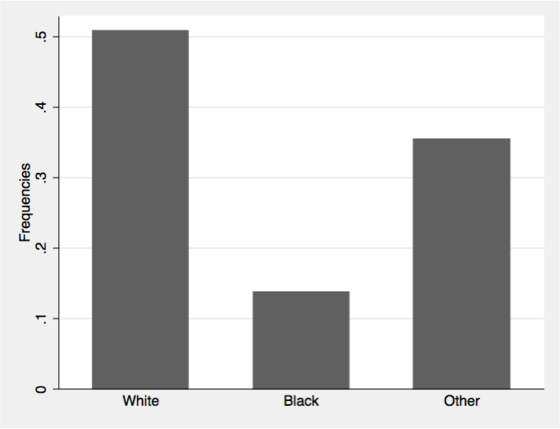
Here is one way to draw a bar chart of frequencies for mothers' ethnicity.
tabulate race, generate(racec)
graph bar racec*, ascategory yvaroptions(relabel(1 "White" 2 "Black" 3 "Other")) ///
  ytitle("Frequencies")
We can add (sum) after graph bar to get counts instead of frequencies.
We often find the following suggestion on Stata list server, which basically consists in letting Stata acumulate counts for a constant variable, here freq, over variable categories with a sum command.
generate freq = 1
graph bar (sum) freq, over(race) ytitle("Ethnicity")
However, if the dataset comes with an unique ID for each individual, it is equivalent to use:
generate id = _n
graph bar (count) id, over(race) asyvars percent showyvars bargap(20) ///
  ytitle("Proportions") legend(off)
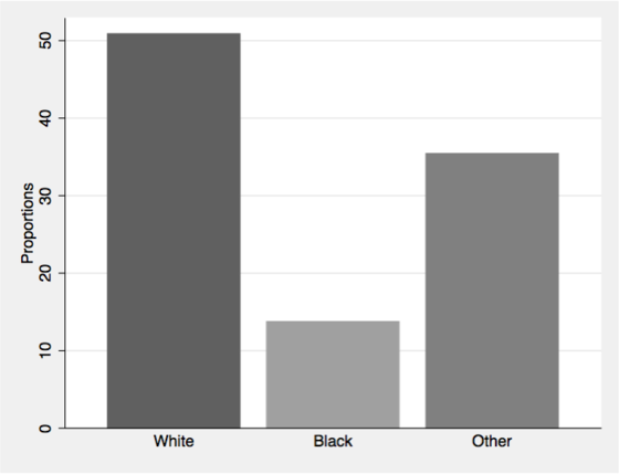
Much simpler, and intuitive!
More, we can use the percent options to display proportions rather than counts. To use the same color for all bars, we can add further options like bar(1, color(gs6)) bar(2, color(gs6)) bar(3, color(gs6)). It is also possible to use twoway bar, as discussed on Stata FAQs, How can I create variables containing percent summaries?.